Thursday, 31 January 2013

Independent Art and Photography - The New Topographics, Bernd and Hilla Becher

New Topographics: Photographs of a Man-altered Landscape was an exhibition in 1975 at George Eastman House, Rochester, NY. The images within the exhibition were based in the USA, and all about the USA, treating the built, man-made environment as a subject in and of itself. The artists in this movement were mostly looking to provide an objective view of the way that the natural environment was being forced to collide with the man-made one - Frank Gohlke, one of the photographers featured within the exhibition, describes the places he photographed as being "increasingly un-individuated scenes". The majority of the images lack sentimentality; the photographers aimed to document the landscape without making their opinions of it immediately obvious. However, it can be argued that, whilst the images for the most part remain objective, the fact that so many photographers were documenting that same kinds of scenes, as a collective they are placing their subjective view about the state of America at the time into the exhibition.

Bernd and Hilla Becher were a couple who later founded the Dusseldorf school of photography in Germany. Hilla was the only female to be included in the New Topographics show.
©Bernd and Hilla Becher

©Bernd and Hilla Becher

©Bernd and Hilla Becher


The Bechers most well known images are those of defunct industrial buildings around the world, which were usually displayed in grids, as seen above. By displaying them in this way, viewers are encouraged to notice the subtle differences between each example of the same type of building. The majority of the public would probably assume that industrial buildings like this all look the same, but the Bechers are attempting to make us notice the unique architectural qualities of each one, as opposed to recognising them purely for their function. The work is not only documentary, but analytical, focussing on these industrial buildings in more detail than they had probably ever been seen (within the context of the art world, at least)
Throughout all the images, for the most part the same set of aesthetics has been strictly adhered to - black and white, relatively low contrast, lots of grey tones (as opposed to heavy blacks and pure whites), flat, neutral light, the same composition, always looking straight at the building, as opposed to looking up or down at it etc. However, what is also maintained is the cold, documentary approach; we don't get any hint of what the photographers were feeling. Is it regret, that the buildings are now defunct, and occasionally in disrepair? An aim for people to see the beauty in the mundane? It is only when considered alongside all of the other photographs in the exhibition that we may see the opinions starting to form.

Wednesday, 23 January 2013

Major Practical Project - Some thoughts on style...

Recently this project has slightly taken a back seat as a cause of my ridiculously time consuming analogue project. However, I have been thinking about style. The recent feedback I had been receiving was that I needed to set myself on a particular set of aesthetics that I should be aiming for - the photographers I have been looking at in my research have extremely varying styles and I need to pinpoint which one is closest to that of my own photographs. Therefore, what I will do in this blog post is talk about each of the artists I have looked at so far, and discuss them purely in the context of their aesthetics.

Penny Klepuszewska
©Penny Klepuszewska, from the series Living Arrangements.


With Klepuszewska, the images she produces in this series often involve a black, or very dark background with objects in the foreground, shot with a small depth of field. They are theatrically lit, which is clear, but they don't look too unnatural. Her work is very focussed on small details, which is something I aim to do in my images too. However, the heavily constructed lighting does abstract the objects from their setting, giving more of an impression of the person that owns them as opposed to the home they come from. I love Klepuszewska's style, but I do feel like it is very different to my own, as I mostly prefer to work using natural light. Particularly in this project, I think it's important that the details I am photographing build up to give the viewer a picture of the house I grew up in. Therefore, I feel that some background information (wallpaper, shapes of rooms etc.) needs to be included.

Colin Gray
©Colin Gray, from the series The Parents.


With Gray's work, again, he has focussed on the details of the home his parents live in, but his work feels much more informal. It seems as if he has taken influence from the snapshot aesthetic, with some of his images not necessarily having to be in perfect sharp focus, or adhering to the rule of thirds. It also seems as if he uses mostly available light, in order to keep the images feeling very natural and simple. Although I don't feel quite as attached to Gray's work as I do to Klepuszewska's I do respect that he uses more of the techniques that I will hopefully be employing in my project.  However, I will hopefully be making much more detailed prints, attempting to keep the most important details in sharp focus.

Anna Fox
©Anna Fox, from the series My Mother's Cupboards and my Father's Words.


For this series, Fox has appeared to utilize flash, in order to light right the way into the backs of the cupboards. It is important that the viewr gets to see all the items within the cupboards, in order to give the most information within the photograph as possible. Although the lines of the images are not straight, and they donb't feel as though Fox has taken a long time to compose them, the images do have sharp, crisp focus. I see the images as stylistically somewhere in between Klepuszewska's highly constructed photographs, and Gray's more snapshot style ones.

Nigel Shafran
©Nigel Shafran, from the series Washing Up 2000.
The images I feel come closest to the idea that I envisage for my own project are those by Nigel Shafran. Again, he looks to have used natural, available light, and it has given the images a very neutral, white tone. I will definitely be looking to acheive a similar aesthetic in my project. However, so far I have been shooting my images form straight on, focussing down on much smaller details, single or small groups of items, for example. I do really appreciate Shafran's celebration of the mundane, which is not only reflected in the subject matter, but in the style too.

I did shoot 3 films worth of images whilst I was at home for Christmas, which arecurrently being processed and printed. I shot them using a relatively neutral style. When the prints have been returned to me I will asses whether I should carry on with the simple, almost deadpan style I have been using so far or if I need to make any adjustments to lighting or style of composition. However, I do hope to stay true to my aims to keep the images simple, let the subject matter speak for itself.

Tuesday, 15 January 2013

Analogue - The finished product & evaluation.

So here, finally, is the finished piece. And here is my long, probably rambling, evaluation of the project.
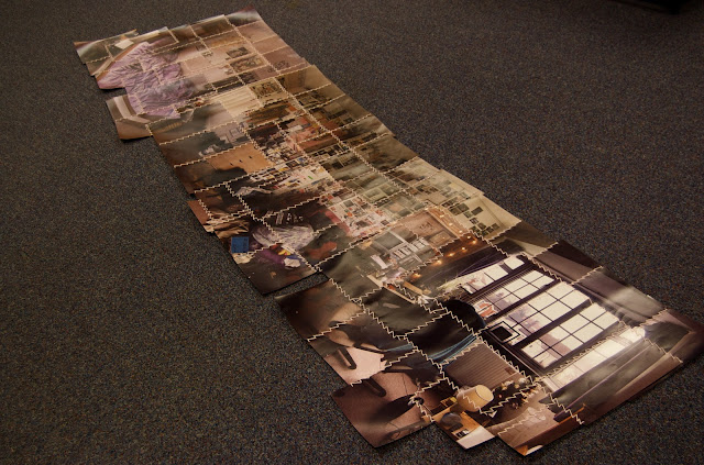
So, right from the beginning of this project I knew I wanted to incorporate printed images with sewing techniques, to play on the idea of 'stitching', now recognised in the world of photography as a Photoshop term. I knew I had to get this idea out there, and so did some research into a photographer that I had seen in the past, but never particularly acknowledged, Maurizio Anzeri, who takes found images and embroiders meticulously detailed designs into them to create beautiful, unique artefacts. Now I knew my sewing skills were not as well practised as his, so I would have to simplify this idea greatly. Whilst researching for my Major Practical Project I remembered a piece that a friend of mine, Lennie Gotterson, had created for her foundation degree in art and design - a long, detailed, line drawing of her street of houses. Combining the two ideas I thought about creating a panorama of my street, but using analogue, hand printed images and stitching them together. Over a few weeks, and with the suggestion that I should make the piece more personal, I settled on the idea of shooting my bedroom.
Here are some more images of the final piece I will be submitting:


On the whole, I am very happy with how the piece has turned out. It's completely different to anything I have done before, and making it presented a whole load of new challenges. However, my main aims for the piece are as follows:

- Create a panorama style image, using analogue processes and stitching the prints together with thread.
- Allow the viewer to get a relatively detailed look into a private space of mine, make it large enough to be able to see the things in the room quite clearly.
- NOT to make it perfectly slick (although I was never really in any danger of this happening)
- Invest something personal to myself in the piece.

I do feel like I have achieved what I set out to do. I didn't want it to be perfectly slick and seamless, because otherwise I may as well have just made a digital panorama. My favourite bits about the piece are where items are repeated, or the perspective is slightly skewed. Realising this came from looking at David Hockey's photographic collages, where people can feature in the image multiple times as they have moved, but the meaning and general impression of the scene remain.
I also think I have succeeded in investing the thread with some meaning and personality. If I were to exhibit I would have to make sure that it was made clear to the viewer that the thread is actually the wool from a cardigan I wore as a toddler, and have long since grown out of, and that this reflects the fact that I've also metaphorically grown out of my bedroom at home. Here is an area where I feel I could have made it more obvious, perhaps featuring a picture of me as a child wearing the cardigan somewhere subtly in the image.
The most difficult thing I found in this project was the printing. I had to do hand prints of around 70 images, ensuring that they were largely the same tone and exposure so that the piece would be coherent. For the most part, I think I have achieved this. However, there are some bits where I think I should have made some reprints:


In the first image, the image of the top of the door/border is a different tone to the one immediatly to it left. In the second the bottom image is clearly darker and in the third there are two images that have a slight green cast, contrasting to the slight magenta one of the rest of the images.
Overall, I really feel I have invested myself in this project, more so than I have done in the past. To me, the more time and emotion in a personal project like this, the better. I like that people can get a bit of an impression of my character from looking at my ridiculously-filled-with-stuff bedroom - I have built up this massive collection of items and stored them in this room for almost 21 years and I like that people could get up close and inspect almost every inch of it. So on the whole, aside from the few bits I have mentioned, I do feel this project has been a success.

Monday, 14 January 2013

Analogue - Progress...

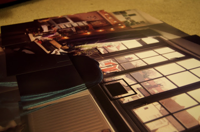
Here's the stage I'm at, I have decided to split the stitching stage into 3 separate bits, so as to avoid the prints being damaged. I will leave them separate whilst I transport them to the uni, them assemble them there. This will hopefully minimise any damage whilst I am transporting it. I've been using the wool unravelled from a cardigan that I wore as a toddler, I chose the pink wool as it reflects the theme of my bedroom - a theme I chose when I was a child. I quite like the reflection between the pink room, now plastered with posters to cover it up, and the pink wool, unravelled from a girly cardigan and now used in a completely different way.


Analogue - The prints, pre-stitching.

Here is how I will be laying the images out, these images were shot as a reference point for when I came to secure and stitch them together.


Analogue - The printing stage, test strips.

The nature of this project means that I don't have to go through a series of negatives and print only the ones that I feel are the best, as would normally happen. For this piece I had to print all 70 images that I shot in the panorama style. Here are some of my test strips, prints with the wrong colour balance and the contact sheets I had printed for me.
Contact Sheet

Contact Sheet


Test Strip. Yellow = 60, Magenta = 60, Cyan = 0. 2, 4, 6, 8, 10 seconds
Test Strip. Y = 80, M = 80, C = 0. 3 seconds.
Test Strip. Y = 80, M = 100, C = 0. 4 seconds.
Test Strip. Y = 85, M = 110, C = 0. 4 seconds.
Test Strip. Y = 95, M = 105, C = 0. 4 seconds.


I settled on these settings for the majority of the prints, occasionally varying the length of time according to how well exposed the negative was. However, there were 2 images for which I had to do separate test srtips, the negatives came out much more magenta than the rest of the images in the series, meaning I added 10 to the magenta filtration. I also had to expose for around 13 seconds on these images.

Saturday, 12 January 2013

Analogue - Daido Moriyama's Apartment

Through the use of hundreds of polaroid images meticulously arranged on the walls of the exhibition space, Moriyama is able to give the audience a glimpse into his apartment. Actually, more than that, the effect looks to be almost life size, meaning the viewer is engulfed in the space, as if they were almost there. Moriyama has taken Hockney's photo collages and made it on a much larger scale, allowing us to inspect every little detail of the place.
Here are some examples of photographs of the installation. Because they are from various different sources the quality does vary.


Moriyama has demonstrated what happens when this idea takes on an epic scale. The amount of detail is almost overwhelming. The project also appears extremely personal - the viewer is invited to inspect every deatil of his apartment. Although I won't be making a piece on this big a scale, the idea behind the piece is the same - giving viewers a detailed insight in a segment of my life. The room I am documenting was the place I grew up, and it reflects my personality - the items I have accumulated have built up over nearly 21 years.

As I have mentioned, I have decided to stick with the images I shot in my bedroom at home, as I feel this links in with my theme of nostalgia that is running through my work this year. I have decided to print each image 8x10" size, so as to enhance the amount of detail. I'll then be sewing over every join with a line of stitches, which will end up forming a kind of abstract grid. Picture of my progress will be posted soon!

Saturday, 5 January 2013

Analogue - The Orginal Bedroom

Whilst at home this week I've been shooting for the major practical project, but I also took plenty of photos to make up a panorama of my bedroom at home. Again, I just had them printed cheaply in order to get an idea of how the final image would look.


The amount of detail captured in the images is greatly improved from the previous piece. However, I do feel that I should have photographed a bit more at the top and bottom of the frames, just to provide a bit of visual relief from the busy images in the centre. The tone is also better, after having photographed on a day with quite flat, white light. I won't be sewing all of these images into place, but I will be testing out stitching a few with my newly unraveled thread, just to get an impression of how it might turn out.
This is my bedroom back at home, but I think I have decided that for my final piece I will be using my bedroom in Broadstairs, simply to act as a contrast to my feelings about the thread I'll be using. However, I think I will need to shoot at least 3 films worth of images in order to capture all that I want to - this piece used two films worth and still needs slightly more at the top and bottom.
The next step is the not inconsiderable task of securing these 72 images together...

Thursday, 3 January 2013

Analogue - My Thread

So I have been looking to add a bit more meaning into the thread that I use for sewing my images together. The idea of finding an old jumper and unraveling it had been been in the back of my mind, but I hadn't given the idea too much thought. However, as we were clearing out our loft over the chirstmas break, I happened upon a bag of baby knitwear. This was not only worn by me and, strangely enough, my brother, but it was all knitted by both of my grandmothers. The clothes have absorbed the unique smell of my home over the years they have been stored here, and, although it might not be immediately obvious, I think the story behind where I got the thread from will bring a whole new dimension to the piece. This could become particularly potent when potentially juxtaposed against the images of my university room, 200 miles away from the place I was brought up.
Please forgive the quality of these iSight photos...